Unlike the other attributes of a chart (e.g., axes labels, headers, legends), the manner in which the data itself is shown in the chart is not a property of the chart (and hence is not edited in the Chart Style A collection of settings for a particular type of result display chart. dialog), but is determined by the type of result and the context in which it is being plotted (e.g., is the result an array A collection of variables that share common output attributes and can be manipulated in GoldSim elements or input expressions., are scenarios being viewed, have classification categories been defined).
As such, Data Styles can be specified in multiple places within GoldSim and the style that is used for a particular chart is a function of the context for the display (discussed below).
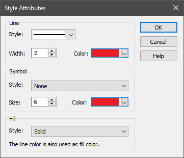
In all cases, however, the Data Style dialog for a particular data set looks like this:

For each data set, you can select the Line Style (e.g., solid, dashed, etc.), the Line Width (in pixels) and the Line Color. You can also choose to plot a symbol at the data points (the default is no symbol is shown), and select a Symbol Style (e.g., square, solid circle, etc.), Symbol Size (in pixels), and Symbol Color. For bar charts, you can also choose the Fill Style. The selected line color is used as the fill color.
There are several different places from where this dialog can be accessed. It is easiest to summarize this by examining each type of result separately.
Time History Results
- In most situations, the Data Style is specified directly in the Result properties dialog.
- If you are plotting an array, the Data Style for the different array items is defined in the Array Label Set dialog.
- If you have run multiple realizations and you are displaying Probabilities, the Data Style for the display is specified at the top of the Monte Carlo Result Display Properties dialog (in the section labeled "History Statistics"). This dialog is accessed by pressing the Options... button in the Result Properties dialog of a Time History Result element A Result element that shows the history of a particular output as a function of time..
- If you have run multiple realizations; 2) you have defined more than one category; and 3) you are displaying All Realizations, GoldSim will label the curves in the Time History Chart based on the categories you have defined. The Data Style for categories is defined at the bottom of the Monte Carlo Result Display Properties dialog (in the section labeled "Realization Classification and Screening"). This dialog is accessed by pressing the Options... button in the Result Properties dialog of a Time History Result element.
- When a model is in Scenario Mode The state of a model when it contains scenario results, allowing multiple scenarios to be compared., the Data Style for the different scenarios is controlled by the Scenario Manager A dialog that allows you to create, define and run scenarios. dialog (accessed from the main menu (Run | Scenario Manager...) or by pressing F7).
Distribution Results
- In most situations, the Data Style is specified directly in the Result properties dialog.
- If you have run multiple realizations; 2) you have defined more than one category; and 3) the Distribution Result has only a single result defined, GoldSim will label the curves in the Distribution Chart based on the categories you have defined. The Data Style for categories is defined at the bottom of the Monte Carlo Result Display Properties dialog (in the section labeled "Realization Classification and Screening"). This dialog is accessed by pressing the Options... button in the Result Properties dialog of a Time History Result element.
- When a model is in Scenario Mode, the Data Style for the different scenarios is controlled by the Scenario Manager dialog (accessed from the main menu (Run | Scenario Manager...) or by pressing F7).
Final Value Results
- Unlike all other result types, the colors of the bars, columns and pie slices in a Final Value chart are auto-selected and cannot be controlled by the user.
Multi-Variate Results
- In the absence of Classification categories, the symbol used for a scatter plot is fixed and cannot be edited (a solid red square).
- If you defined more than one category, GoldSim will label the points in the Scatter Plots based on the categories you have defined. The Data Style for categories is defined at the bottom of the Monte Carlo Result Display Properties dialog (in the section labeled "Realization Classification and Screening"). This dialog is accessed by pressing the Options... button in the Result Properties dialog of a Time History Result element.
Array Results
- The Data Style for the different array items is defined in the Array Label Set dialog.
Learn more
- Using and Managing the Color Palette
- Viewing the Properties of a Time History Result
- Viewing Time Histories for Array Outputs
- Viewing Probability Histories for Multiple Realizations
- Using Result Classification and Screening in Time History Results
- Viewing Scenario Results in Time History Result Elements
- Viewing the Properties of a Distribution Result
- Using Result Classification and Screening in Distribution Results
- Viewing Scenario Results in Distribution Result Elements
- Using Result Classification and Screening in Multi-Variate Results
- Controlling the Chart Style in Array Results