GoldSim has powerful charting capabilities that allow you to customize the appearance of each chart. This includes adding headers and footers, and changing axis scales and labels. Most of these attributes can be edited by pressing the Edit Chart Style button at the top of the Time History Chart window:

Pressing this button (or right-clicking in a chart and selecting Edit Chart Style...) provides access to the following dialog for editing the various chart properties:
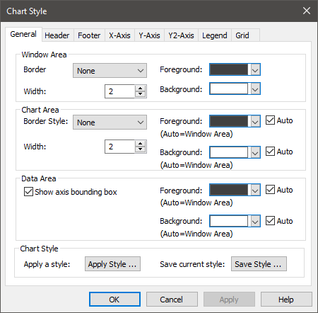
This dialog is common to all types of charts, and is discussed elsewhere.
One key attribute for charts is how values on axes are displayed. You cannot control the number of significant figures displayed (this is automatically determined). You can, however, control under what circumstances scientific notation is used via the Results tab of the Options dialog (accessed via Model |Options... from the main menu).
In addition to the basic chart attributes controlled by the Chart Style A collection of settings for a particular type of result display chart. dialog, the Time History Result Properties dialog itself is used to control some of the attributes of a chart:
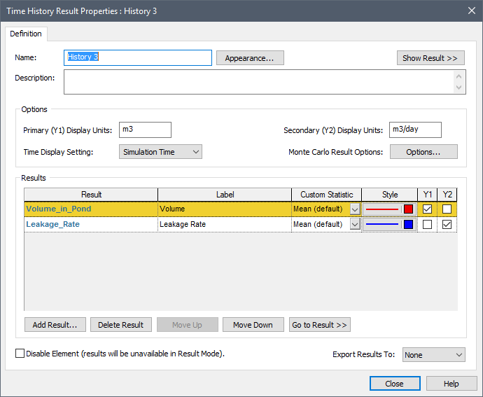
In particular,
- The units for each axis default to the Display Units The units (e.g., m, g, $/day) in which an output is displayed within GoldSim. of the first result added to each axis. However, you can change the Display Units that are displayed from within the Result Properties dialog.
- Only those results in which either the Y1 or Y2 box is checked will be included in displays. Hence, after adding a result to the list, you can temporarily hide it from displays by clearing one of these boxes.
- The Label is user-editable, and is used in legends (and column headers for tables).
Note: You can hide or show the legend on a chart via the context menu (i.e., accessed by right-clicking in the chart).
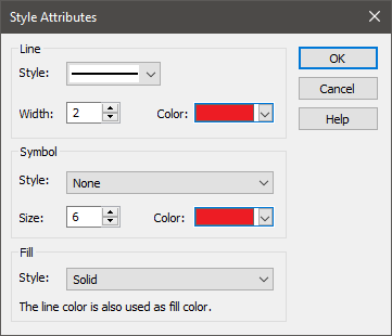
- The Style of each
line displayed in a Time History Chart can be edited by clicking on the field
(in the Style column) corresponding to each result. This provides access
to the following dialog for editing the line style (for a distribution) or the
fill style (for a single realization A single model run within a Monte Carlo simulation. It represents one possible path the system could follow through time. display):
If you are plotting an array A collection of variables that share common output attributes and can be manipulated in GoldSim elements or input expressions., the Data Style for the different array items is defined in the Array Label Set dialog.
If you have run multiple realizations and you are displaying Probabilities, the Data Style for the display is specified at the top of the Monte Carlo Result Display Properties dialog (in the section labeled "History Statistics"). This dialog is accessed by pressing the Options... button in the Result Properties dialog of a Time History Result element A Result element that shows the history of a particular output as a function of time..
When viewing a Time History result, if 1) you have run multiple realizations; 2) you have defined more than one category; and 3) you are displaying All Realizations, GoldSim will label the curves in the Time History Chart based on the categories you have defined.
The chart will display all realizations for a single result, with each curve having a style defined by its category. For each category, you can edit the Style via the Monte Carlo Result Display Properties dialog (accessed by pressing the Options... button in the Result Properties dialog of a Time History Result element):
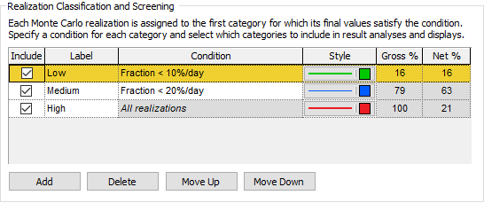
The Style used for each category displayed in a Time History Chart can be edited by clicking on the field (in the Style column) corresponding to each category.
When a model is in Scenario Mode The state of a model when it contains scenario results, allowing multiple scenarios to be compared., Time History Result elements can be used to view scenario A specific set of input data (and corresponding outputs) for a model. Multiple scenarios can be defined for a model. Different scenarios within a model are specifically differentiated by having different values for one or more Data elements. results. In this case, the line style for time history results for the different scenarios is controlled by the Scenario Manager A dialog that allows you to create, define and run scenarios. dialog (accessed from the main menu (Run | Scenario Manager...) or by pressing F7):
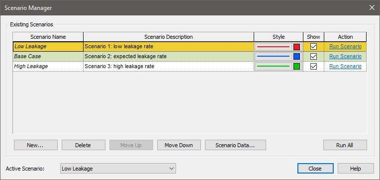
In order for scenario results to be displayed in a Time History Result element, the Show button must be checked for each scenario to be displayed in the Scenario Manager.
Note that for each scenario, you can edit the Style, as well as the Scenario Name, which is used in legends (and column headers for tables).
Learn more
- Editing the Appearance of a Chartt
- Controlling Significant Figures and Scientific Notation in Result Displays
- Editing Data Styles
- Viewing Time Histories for Array Outputs
- Viewing Probability Histories for Multiple Realizations
- Using Result Classification and Screening in Distribution Results
- Viewing Scenario Results in Time History Result Elements
- Controlling the Chart Style in Time History Results
- Disabling a Time History Result Element
- Exporting from a Time History Result Element to a Spreadsheet
- Exporting from a Time History Result Element to a Text File
- Using Result Classification and Screening in Time History Results
- Viewing a Time History Chart
- Viewing a Time History Table
- Viewing Reporting Period-Based Results in Time History Result Elements
- Viewing Scenario Results in Time History Result Elements
- Viewing SubModel Results in Time History Result Elements
- Viewing the Properties of a Time History Result
- Viewing Time Histories for Array Outputs
- Viewing Time Histories of Multiple Outputs
- Viewing Time Histories of Multiple Realizations
- Viewing Unscheduled Updates in Time History Result Elements