The Button control A special control that can be added to a Dashboard that provides a mechanism for linking a wide range of actions to a button. is perhaps the most versatile of all of the Dashboard A special GoldSim element that allows you to build custom interfaces or "control panels" for your models. controls. It allows the Author to link one of a large number of actions to a button that is placed on the Dashboard.
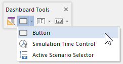
The toolbar button can be found here:
The Button control looks like this when it is added to a Dashboard and selected:

The eight handles allow you to resize the control. For more precise changes, you can also change the width of the control using Ctrl+Left and Ctrl+Right, and change the height using Ctrl+Up and Ctrl+Down. (The default change is 1 pixel at a time. If you press the Shift key, the change is 5 pixels).
Note, however, that resizing the control does not resize the Button label; it simply makes the Button larger. The font and font size for the Button label are fixed (they use the default GUI font specified by the operating system).
Note: If you wish the Button label to use a different font or font-size, you can do so by creating an image for the Button, placing the actual Button on top of the image, and making the Button Style transparent.
Double-clicking on a Button control displays the following properties dialog:
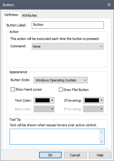
The Button Label defines the text that appears on face of the Button.
Note: You should always ensure that the Button is sized to allow for some space around (above, below, left, right) the Button Label. Otherwise, the text could potentially be cut off at certain resolutions and/or text scaling.
Note: If you want to include an ampersand (&) in your Button Label, you must enter it twice. That is, "X && Y" entered as a Button Label will appear on the Button as "X & Y".
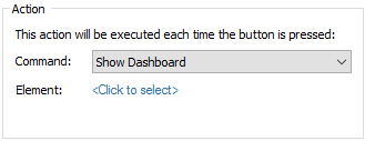
The command that the Button carries out when it is pressed is specified by selecting an option from the Command drop-list. Depending on the option selected, one or more additional fields may be required in order to specifically control how the Button behaves. For example, if you select the "Show Dashboard" command, one additional field is provided to allow you to enter the name of the Dashboard element:
A complete list of the available commands, a description of what they do, and the additional required information is summarized below.
| Command | Description | Required Information |
| Run Model | Runs the GoldSim model. Equivalent to pressing the Run button in the Run Control toolbar. | None |
| Reset Model | Resets the model to Run Mode ("Ready") from Result Mode so input controls can be used. Equivalent to pressing the Reset button in the Run Control toolbar. | None |
| Go to Element | Jumps to the specified element in the graphics pane (but does not open the property dialog). | Element ID |
| Open Element | Opens the specified element's property dialog (but does not jump to it in the graphics pane). | Element ID |
| Show Container | Shows the contents of the specified Container in the graphics pane. | Container ID |
| Execute Application | Runs the specified application. | Name and path to executable and any required command line arguments |
| Open File | Launches the application associated with the specified file and opens the specified file. | Name and path to file. For Microsoft Excel files, you can optionally specify the sheet and cell(s) to be selected when the file is opened |
| Open URL | Opens the specified URL in a browser. | URL |
| Show Dashboard | Displays the specified Dashboard. | Dashboard ID |
| Show Result | Shows the specified Result element as a table or chart. | Result element ID |
| Close Application | Closes GoldSim (or the GoldSim Player). | None |
| Show Message Box | Displays a short message dialog (with an OK button to close the dialog) | Title (displayed in the dialog's Title Bar) and the Message |
| Global Database Download | Performs a download to all elements linked to databases in the model. | If Extended GoldSim database is used, you are prompted for the effective date. |
| Edit Time Series Data | Allows you to edit the data defining a Time Series element. | Time Series Element ID |
| Edit Lookup Table Data | Allows you to edit the data defining a Lookup Table element. | Lookup Table Element ID |
| Select Spreadsheet File for Element | Allows you to change the spreadsheet file that the element is linked to. | Element ID |
| Show Simulation Settings | Allows you to view and edit the simulation's time and Monte Carlo Settings. | Category (Time or Monte Carlo) |
| Set Input Components to Default Values | Sets all of the input components in the current Dashboard or all Dashboards to their Default values. | Apply to this Dashboard or all Dashboards |
| Refresh all Spreadsheet outputs | Imports all outputs from Spreadsheet elements into model. Useful if you want to import and view prior to running the simulation. | None |
| Export Simulation Results | Executes a global export of available results from Time History Result elements that are specified to export to spreadsheets and/or text files. Equivalent to pressing "Export Now" button from Results tab of Options dialog in GoldSim. | None |
Some of these commands are self-explanatory.
Others (those highlighted in bold) are discussed in greater detail in the
If a button is not yet assigned a command, or if the required information for the selected command is incomplete, GoldSim indicates this by outlining the control with a dashed red line:
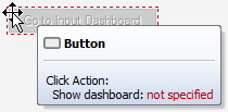
When viewed in the Player, a Button that was not assigned a command or had incomplete information would simply be grayed out.
Within a Dashboard, Buttons can be pressed by left-clicking on them, or by pressing the space bar when the Button has the focus.
The Appearance section of the properties dialog allows you to modify the appearance of the Button. GoldSim provides a wide variety of options for what the Button looks like in the Dashboard. The best way to understand the various options is to simply experiment with them to see how they change the control's appearance.
Note: You cannot select the font or font size for the Button label. GoldSim always uses the default GUI font used by the operating system. However, the Transparent Button Style allows you to place an image (with any font or font size) behind a Button. In this case, you would leave the Button Label blank.
Note: When selecting the Transparent Button Style, the Button is always transparent. However, depending on whether or not you have selected Draw Flat Button, it behaves differently. If Draw Flat Button is selected, you must then select a Hover Color (the color the Button takes on when you hover over it), along with an Opacity. If Draw Flat Button is cleared, rather than changing when you hover, the Button only changes appearance when it is pressed. Hence, you must select a Pressed Color (the color the Button takes on when you press it), along with an Opacity.
The bottom section of the dialog allows you to enter a tool tip, which will be displayed whenever the user holds the mouse cursor over the Button.
The Attributes tab of the dialog provides tools that allow you to hide or disable the control dynamically based on the values of various model outputs. This allows you, for example, to hide the control if it was not applicable under certain situations.
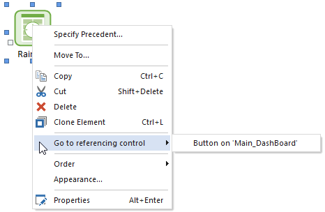
If you right-click on an element that is linked to one or more button controls, you can immediately jump to those controls:
Similarly, if a button control is linked to an element, you can jump to the connected element from the control's context menu:
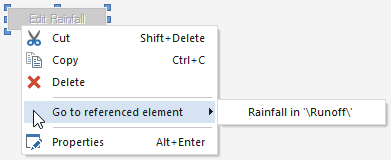
If the button control has specified attributes that reference outputs for hiding and/or disabling the control, the element(s) associated with these outputs are also displayed.
Learn more
- Displaying Chart and Table Results Using a Button
- Using and Managing the Color Palette
- Editing Time Series Elements Using a Button
- Editing Lookup Table Elements Using a Button
- Specifying a Linked Spreadsheet File Using a Button
- Displaying the Simulation Settings Dialog Using a Button
- Resetting Default Values Using a Button
- Exporting Simulation Results
- Displaying a Message Using a Button
- Dynamically Disabling and Hiding Dashboard Controls
- Adding Controls to Dashboards
- Aligning and Positioning Dashboard Controls
- Controlling the Tab Order in a Dashboard
- Copying and Moving Dashboards and Controls
- Dynamically Disabling and Hiding Dashboard Controls
- Input Controls
- Output Controls
- Overview of Dashboard Controls
- Using the Button Control
- Using the Scenario Control
- Using the Simulation Time Control