In some models, some inputs (or outputs) may not be applicable based on the values of other inputs (or outputs) in the model. For these situations, GoldSim allows you to disable or hide Dashboard A special GoldSim element that allows you to build custom interfaces or "control panels" for your models. controls based on various model attributes.
Disabling a control grays it out on the Dashboard (so it cannot be edited). When a control is hidden, it cannot be seen at all on the Dashboard (hiding a control also disables it).
Examples of what you can do with this feature include the following:
- Show a control only if a different check box control An input control that can be added to a Dashboard that provides a mechanism for making a binary selection (i.e., yes/no, on/off, 10/20). on the Dashboard is checked.
- Enable an input control A type of control which can be added to a GoldSim model (when using the Dashboard Authoring tools) in order to construct a customized user interface (a dashboard) for the model. Input controls (e.g., sliders, checkboxes and input edit fields) are linked directly to Data elements and allow a user to directly modify the values of these elements via the dashboard. only if another input control's current value is greater than 10.
- Show an output control A type of control which can be added to a GoldSim model (when using the Dashboard Authoring Module) in order to construct a customized user interface (a dashboard) for the model. Output controls (e.g., thermometers, result displays) are linked directly to GoldSim elements and allow a user to directly view the values of these elements via the dashboard. only if a specific model output is True.
- Enable a control only if a specific model output's current value is between 0 and 100.
- Enable a control only if a specific model output's current value is one of several specified values.
This feature is provided in the Attributes tab of each control:
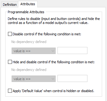
All controls have an Attributes tab, but it differs slightly between the various types of controls. In particular,
- You cannot disable Output controls; you can only hide them. As a result the first check box in the dialog is disabled for Output controls.
- The Apply "Default Value"... check box is only available for Input controls. It is not available for Output controls or Button controls.
By default, controls are visible and enabled. To disable or hide a control, click on the appropriate check box. When you do this, a dialog will be displayed explaining what to do next (select OK), followed by a browser An alternative view of a GoldSim model, in which elements are displayed in a tree, and organized either hierarchically, or by type. which shows all of the outputs in the model that are scalars (values or conditions). Once you have selected an output, it will be displayed in the dialog:
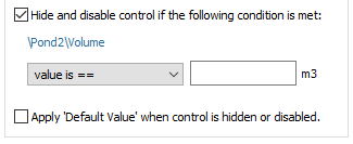
Note: You can change the selected output by clicking on it in the dialog. Doing so will open a browser for selecting a new output.
Once the output is selected, you must then select the type of condition that is to be tested from the drop-list. If the output is a value, the following options are available:
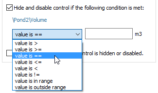
Most of these condition types require a single value entered immediately to the right. For example, the dialog below would hide (and disable) the control if the value of Volume was greater than 10 m3:
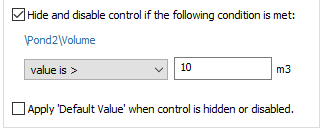
Note that this value cannot be entered as a link or expression, and no units can be specified. The units that are used are automatically displayed to the right of the field (and are the Display Units The units (e.g., m, g, $/day) in which an output is displayed within GoldSim. for the output).
The following condition types require or accept multiple values in the field to the right:
- "value is in range" requires two values, which must be separated by a semicolon. The evaluation is inclusive with regard the ends of the range (e.g., if the range is 5 to 10, then values of 5 or 10 are considered inside the range).
- "value is outside range" requires two values, which must be separated by a semicolon. The evaluation is inclusive with regard to the ends of the range (e.g., if the range is 5 to 10, then values of 5 or 10 are considered inside the range).
- "value is = =" (value is equal to) supports (but does not require) multiple values (which must be separated by semicolons). If multiple values are provided, the test is considered to be true if any of the conditions are met (i.e., the conditions are ORed).
- "value is =!" (value is not equal) supports (but does not require) multiple values (which must be separated by semicolons). If multiple values are provided, the test is considered to be true if all of the conditions are met (i.e., the conditions are ANDed).
If the output selected for the attribute is a condition, only two condition types are available in the drop list:
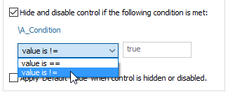
The field to the right is "hardwired" to True (i.e., it cannot be edited). These two choices, therefore, allow you to apply the attribute when the specified output is either True or Not True (False).
Input controls all have Default values that are defined by the Dashboard author. The Attributes tab of Input controls has a special option that can be selected to Apply "Default Value" when control is hidden or disabled. If this check box is checked, when the control transitions from a visible state to a disabled or hidden state, the default value is automatically assigned to the element linked to the control.
Note: If the model is Paused or running, this will only occur if the "Allow changes while paused" box is checked for the control.
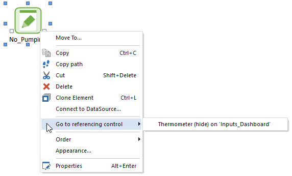
Note that if an element is referenced by a control in order to hide and/or disable it, this is indicated in the context menu for the element:
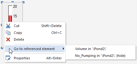
Similarly, if a Dashboard control An object that can be added to a GoldSim model (via the Dashboard Authoring tools) in order to construct a customized user interface (a dashboard) for the model. Controls provided by GoldSim include buttons, checkboxes, sliders, input edit fields, text boxes and result displays. references an output for hiding and/or disabling the control, the element associated with this output is displayed in the context menu for the control:
- Adding Controls to Dashboards
- Aligning and Positioning Dashboard Controls
- Controlling the Tab Order in a Dashboard
- Copying and Moving Dashboards and Controls
- Dynamically Disabling and Hiding Dashboard Controls
- Input Controls
- Output Controls
- Overview of Dashboard Controls
- Using the Button Control
- Using the Scenario Control
- Using the Simulation Time Control