The most basic and versatile of the input controls is the Input Edit Box control An input control that can be added to a Dashboard that provides a mechanism for typing values directly into an input field.. This control provides a mechanism for typing values directly into an input field.
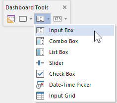
The toolbar button can be found here:

The Input Edit Box control looks like this when it is added to a Dashboard A special GoldSim element that allows you to build custom interfaces or "control panels" for your models. and selected:

The eight handles allow you to resize the control. For more precise changes, you can also change the width of the control using Ctrl+Left and Ctrl+Right, and change the height using Ctrl+Up and Ctrl+Down. (The default change is 1 pixel at a time. If you press the Shift key, the change is 5 pixels).
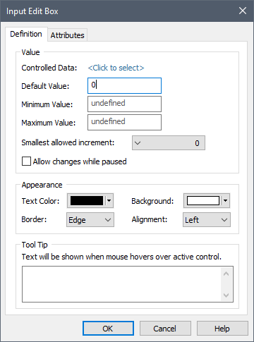
Double-clicking on the control displays the following properties dialog:

Within the Value portion of the dialog, the Data element An input element intended to represent constant inputs in a model. to which the control is to be linked is specified. You do this by pressing <Click to select>. This will display a browser An alternative view of a GoldSim model, in which elements are displayed in a tree, and organized either hierarchically, or by type. which shows all of the scalar An output consisting of a single value or condition. value Data elements in the model (condition Data elements are not listed).
Once you have linked the control to an element, the linked element will be listed:

You can remove the linkage (by clicking the red X button), or reassign the linkage (by clicking the name of the element itself).
The Default value can be used in conjunction with an optional Button control A special control that can be added to a Dashboard that provides a mechanism for linking a wide range of actions to a button. that the Author can provide in a Dashboard that allows the Player user to reset all input controls to default values.
Note: Within GoldSim, you can reset all of the input controls in a Dashboard to their default values by right-clicking anywhere in the Dashboard, and selecting Set to Default Values.
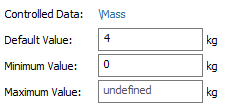
The Minimum and Maximum values define the range of values that the input field will accept. (By default they are undefined, which means that the range of values is unrestricted). If the Dashboard user enters a value outside of this range, an error will be displayed, and the value will not be accepted. Note that you cannot specify a link or expression in the Default, Minimum and Maximum fields. In fact, these fields only accept numbers without units. If the Data element has dimensions An output attribute for an element that defines the dimensionality (in terms of Length, Time and other fundamental dimensions) of the output., these fields assume that the value is being specified in the display units The units (e.g., m, g, $/day) in which an output is displayed within GoldSim. of the Data element (which are displayed directly to the right of the three fields):

You can set a field to "undefined" by simply leaving it blank.
Warning: If the Data element to which the control is linked has dimensions, the Input Edit Field control assumes that the value is being entered in the display units of the Data element. Hence, as an author, it is your responsibility to inform the user of the units of the input (e.g., in the control's tool tip and/or text surrounding the control).
The Smallest allowed increment is a drop list that lets you control the precision of the values that are entered into the field in the Dashboard. For example, if you select 0.1 in this field, the user can only enter values that are multiples of 0.1; if you enter 100 in this field, the user can only enter values that are multiples of 100. If the Dashboard user enters a value that does not meet the requirements, an error will be displayed, and the value will not be accepted. The default value of 0 puts no constraints on the value.
The Allow changes while paused check box determines whether Dashboard users will be able to edit the field in the middle of a simulation (i.e., after the model is paused). If this check box is cleared (the default) the user can only edit the field prior to the start of the simulation. If the model is paused, the field will not be editable. If the check box is checked, the user will be permitted to edit the field while the model is paused in the middle of a simulation.
Note: Even if this box is checked, if the model contains any scenarios, no changes can be made while the model is paused.
The Appearance section of the properties dialog allows you to modify the Text Color, Background (color), text Alignment, and type of Border for the input box. These options are self-explanatory, and you may want to experiment with them to see how they change the control's appearance. The size of the numbers entered in the box is controlled by the size of the box (GoldSim scales up the font size to match the input box size).
Note: You cannot select the font for an input edit box control. GoldSim always uses the default GUI font used by the operating system. The font is dynamically scaled based on the height of the edit box.
The bottom section of the dialog allows you to enter a tool tip, which will be displayed whenever the Dashboard user holds the mouse cursor over the control.
The Attributes tab of the dialog provides tools that allow you to hide or disable the control dynamically based on the values of various model outputs. This allows you, for example, to hide the control if it was not applicable under certain situations.
Learn more
- Check Box Control
- Combo Box Control
- Connecting a Data Element to Multiple Input Controls
- Controlling the Tab Order in a Dashboard
- Date-Time Control
- Displaying the Simulation Settings Dialog Using a Button
- Editing Lookup Table Elements Using a Button
- Editing Time Series Elements Using a Button
- Input Edit Box Control
- Input Grid Control
- List Box Control
- Resetting Default Values Using a Button
- Slider Control