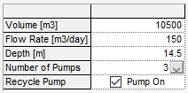
The Input Grid provides an alternative to creating numerous individual controls and positioning them in a Dashboard A special GoldSim element that allows you to build custom interfaces or "control panels" for your models. by allowing you to create a grid of controls. The grid cells can reference scalar An output consisting of a single value or condition., vector A one-dimensional array. or matrix A two-dimensional array. Data elements, and can be Edit boxes, Check boxes or Combo boxes:

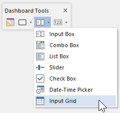
The toolbar button can be found here:

The Input Grid control An input control that can be added to a Dashboard that provides a mechanism for entering inputs (in the form of edit boxes, check boxes or combo boxes) into a grid. looks like this when it is added to a Dashboard and selected:

The eight handles allow you to resize the control. For more precise changes, you can also change the width of the control using Ctrl+Left and Ctrl+Right, and change the height using Ctrl+Up and Ctrl+Down. (The default change is 1 pixel at a time. If you press the Shift key, the change is 5 pixels).
Note, however, that resizing the control does not resize the text (labels or numbers) inside the control; it simply adds empty space around the control. The font size for the text and numbers is fixed (they use the default GUI font specified by the operating system).
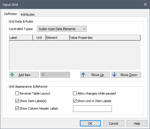
Double-clicking on the control displays the following properties dialog:

The first step in using the Input Grid control is to specify the type of Data elements that it will be used to control using the Controlled Types drop-list. An Input Grid can control either a specified number of scalar Data elements, a specified number of vector Data elements, or a single Matrix Data element An input element intended to represent constant inputs in a model.:

The manner in which the Input Grid control is used for each
of these types is described in the
Learn more
- Check Box Control
- Combo Box Control
- Connecting a Data Element to Multiple Input Controls
- Controlling the Tab Order in a Dashboard
- Date-Time Control
- Displaying the Simulation Settings Dialog Using a Button
- Editing Lookup Table Elements Using a Button
- Editing Time Series Elements Using a Button
- Input Edit Box Control
- Input Grid Control
- List Box Control
- Resetting Default Values Using a Button
- Slider Control