The Check Box control An input control that can be added to a Dashboard that provides a mechanism for making a binary selection (i.e., yes/no, on/off, 10/20). allows you to add a binary selection (e.g., true/false, on/off, 1/0, 100/300, etc.) to a Dashboard A special GoldSim element that allows you to build custom interfaces or "control panels" for your models..
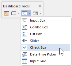
The toolbar button can be found here:

The Check Box control looks like this when it is added to a Dashboard and selected:

The eight handles allow you to resize the control. For more precise changes, you can also change the width of the control using Ctrl+Left and Ctrl+Right, and change the height using Ctrl+Up and Ctrl+Down. (The default change is 1 pixel at a time. If you press the Shift key, the change is 5 pixels).
Note, however, that resizing the control does not resize the box or the label itself (it simply adds empty space around the box and label). The box and font size for the label are fixed (they use the default GUI font specified by the operating system).
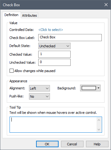
Double-clicking on the control displays the following properties dialog:

Within the Value portion of the dialog, the Data element An input element intended to represent constant inputs in a model. to which the control is to be linked is specified. You do this by pressing <Click to select>. This will display a browser An alternative view of a GoldSim model, in which elements are displayed in a tree, and organized either hierarchically, or by type. which shows all of the scalar An output consisting of a single value or condition. Data elements in the model (both values and condition Data elements are listed).
Once you have linked the control to an element, the linked element will be listed:

You can remove the linkage (by pressing the red X button), or reassign the linkage (by pressing the name of the element itself).
The Check Box Label allows you to specify the label that is displayed next to the check box. As discussed below, you can also control where the label is placed. By default, the check box is aligned left and the label is placed to the right of the check box.
The Default State can be used in conjunction with an optional Button control A special control that can be added to a Dashboard that provides a mechanism for linking a wide range of actions to a button. that the Author can provide in a Dashboard that allows the Player user to reset all input controls to default values.
Note: Within GoldSim, you can reset all of the input controls in a Dashboard to their default values by right-clicking anywhere in the Dashboard, and selecting Set to Default Values.
If the selected Data element is a value, the Checked Value and Unchecked Value fields are available. These represent the value that the linked Data element takes on when the Check Box control is checked or unchecked, respectively. You cannot specify a link or expression in these fields. In fact, these fields only accept numbers without units. If the Data element has dimensions An output attribute for an element that defines the dimensionality (in terms of Length, Time and other fundamental dimensions) of the output., these fields assume that the value is being specified in the display units The units (e.g., m, g, $/day) in which an output is displayed within GoldSim. of the Data element (which is displayed directly to the right of the two fields):

Note: Since a user has no way of knowing the values which will be used when the Check Box is checked or unchecked, it is good practice as an author to inform the user of these values directly (e.g., in the control's tool tip and/or text surrounding the control). An even more effective way to do this is to add a Result Display control An output control that can be added to a Dashboard that provides a mechanism for viewing scalar outputs directly. linked to the same Data element and place it next to the check box so that the corresponding values are automatically displayed when the Check Box is checked or unchecked.
If the selected Data element is a condition, the Checked and Unchecked fields are automatically set to True and False, respectively, and grayed out:

The Allow changes while paused check box determines whether Dashboard users will be able to edit the control (check and clear the box) in the middle of a simulation (i.e., after the model is paused). If this check box is cleared (the default) the user can only edit the field prior to the start of the simulation. If the model is paused, the field will not be editable. If the check box is checked, the user will be permitted to edit the field while the model is paused in the middle of a simulation.
Note: Even if this box is checked, if the model contains any scenarios, no changes can be made while the model is paused.
The Appearance section of the properties dialog allows you to modify Background (color).
Note: Using and creating custom colors for objects is discussed in detail in Chapter 6 of the GoldSim User's Guide.
It also allows you to change the following:
Alignment: Left alignment aligns the box to the left and the label appears to the right of the box. Right alignment aligns the box to the right and the label appears to the left of the box.
Push-like: If this is
selected, the Check Box appears as a button with two states (depressed or
cleared). In general, this is only useful if you are placing multiple
check boxes next to each other on a Dashboard (otherwise the state of the
control may not be obvious to the user). An example is shown below:
Note: You cannot select the font or font size for a check box control label. GoldSim always uses the default GUI font and font size used by the operating system.
The bottom section of the dialog allows you to enter a tool tip, which will be displayed whenever the Dashboard user holds the mouse cursor over the control.
The Attributes tab of the dialog provides tools that allow you to hide or disable the control dynamically based on the values of various model outputs. This allows you, for example, to hide the control if it was not applicable under certain situations.
Learn more
- Check Box Control
- Combo Box Control
- Connecting a Data Element to Multiple Input Controls
- Controlling the Tab Order in a Dashboard
- Date-Time Control
- Displaying the Simulation Settings Dialog Using a Button
- Editing Lookup Table Elements Using a Button
- Editing Time Series Elements Using a Button
- Input Edit Box Control
- Input Grid Control
- List Box Control
- Resetting Default Values Using a Button
- Slider Control