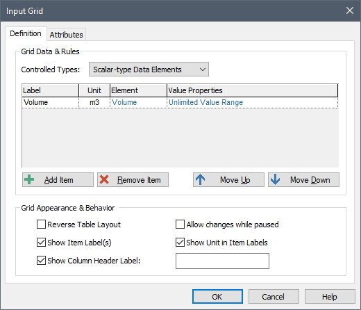
If you select "Scalar An output consisting of a single value or condition.-type Data Elements" (the default) from the Controlled Types drop-list in the Input Grid control An input control that can be added to a Dashboard that provides a mechanism for entering inputs (in the form of edit boxes, check boxes or combo boxes) into a grid. dialog, you can use the Input Grid to control one or more scalar Data elements.
To do so, you must first specify the scalar Data elements that you wish to add to the grid. This is done by pressing the Add Item button. This will display a browser An alternative view of a GoldSim model, in which elements are displayed in a tree, and organized either hierarchically, or by type. which shows all of the scalar Data elements in the model.
Once you select an element, the dialog will look like this:

You can remove a selected element (by pressing Remove Item), or select a different element by pressing the name of the element itself. Once you have added multiple elements, the Move Up and Move Down buttons allow you to control the order that the items appear in the grid.
By default, grid cells are displayed in the Dashboard A special GoldSim element that allows you to build custom interfaces or "control panels" for your models. as simple edit boxes (with no minimum or maximum value and a default value of 0). You can specify minimum and maximum values, and edit other grid cell properties (i.e., controlling whether they are edit boxes, check boxes or combo boxes) by clicking the blue text corresponding to that particular cell in the "Value Properties" column.
The check boxes in the "Grid Appearance & Behavior" section of the dialog control how the input grid appears in the Dashboard. The Show Item Label(s) and Show Unit in Item Labels are on by default, such that the grid appears like this in the Dashboard:

You can choose to hide the labels and units by clearing the boxes.
If you select Show Column Header Labels and enter a label (e.g., "Enter a Value"), it appears like this:

If you select Reverse Table Layout, the rows and columns are reversed:

Within a Dashboard, if the grid is too small to display all of the grid cells, scroll bars are added.
Note: When a Dashboard is active (such that controls can be edited) either in GoldSim or the GoldSim Player A program that allows you to "play" or "read" an existing GoldSim model without having to license the GoldSim software. The GoldSim Player is available as a free download from the GoldSim website., you can paste multiple data points from the clipboard (e.g., which may have been copied from a spreadsheet) into a grid. Several points should be noted: 1) if pasting into a Check Box, only 0 and 1 are recognized; 2) if pasting into a Combo Box, only matching text (not case-sensitive) is recognized; and 3) the orientation must be consistent (e.g., if you are pasting a column of data, the grid must be a column, not a row).
The Allow changes while paused check box determines whether Dashboard users will be able to edit the input grid in the middle of a simulation (i.e., after the model is paused). If this check box is cleared (the default) the user can only edit the grid prior to the start of the simulation. If the model is paused, the field will not be editable. If the check box is checked, the user will be permitted to edit the grid while the model is paused in the middle of a simulation.
Note: Even if this box is checked, if the model contains any scenarios, no changes can be made while the model is paused.