Final Value results are used to carry out side-by-side comparisons of different types of results. To use them, you need to carefully specify what you wish to compare and how you want to display that comparison. Depending on how your model has been run (e.g., multiple realizations, multiple scenarios, multiple Capture Times User-defined points in time during a simulation at which “Final Value” results are captured for result display. The final time point in the simulation is always included as a Capture Time, but additional times can be added.) and the outputs you have specified to compare (e.g., one output, multiple outputs, vector A one-dimensional array. items), there can be a large variety of ways to display the comparison.
In order control how Final Value results are displayed, it is important to understand that for any specific type of run and collection of outputs that you have specified for comparison, there are from one to four "dimensions" of date used to create the display.
Final Value results can be viewed as a table, or as one of several different charts (bar, column, stacked bar, stacked column, or pie). The easiest way to understand the various "dimensions" of the results you wish to view in a Final Value result is to first consider the results displayed as tables.
Let's consider a Final Value Result element A Result element that allowz you to compare results in the form of bar charts, column charts, pie charts and tables. in which we have defined three scalar An output consisting of a single value or condition. outputs:
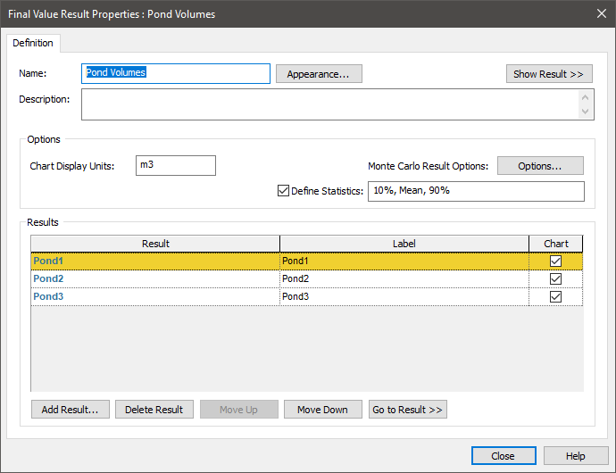
Let's further assume that we have run multiple realizations (and wish to view three statistics, the 10th percentile, the Mean and the 90th percentile), and have run two scenarios. If we were to run all scenarios, we would find that we have a "three dimensional" data set that we wish to view. The three "dimensions An output attribute for an element that defines the dimensionality (in terms of Length, Time and other fundamental dimensions) of the output." are the outputs, the statistics and the scenarios. We can think of this as a "cube" of results. The table view of this in a Final Value Result element would look like this:

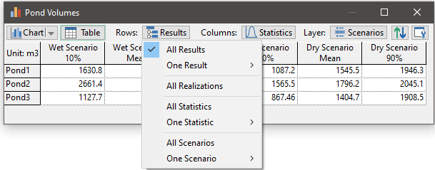
If we click on the Rows button, we see that there are a number of options, and what is selected is "All Results":
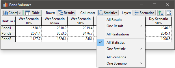
If we click on the Columns button, we see that there are a number of options, and what is selected is "All Statistics":
Finally, if we click on the Layer button, we see that there are a number of options, and what is selected is "All Scenarios":

So in this particular table, we are showing all results (a cube of data of dimension 3 x 3 x 2), in which the rows are the outputs, the columns are the statistics and the layers are the scenarios.
We can change how this table is displayed. For example, we could specify that the rows are the results, the columns are the scenarios and the layers are the statistics:

As another example, we could specify that the rows are the statistics, the columns are the outputs, and only one layer (one scenario A specific set of input data (and corresponding outputs) for a model. Multiple scenarios can be defined for a model. Different scenarios within a model are specifically differentiated by having different values for one or more Data elements.) is displayed:

The point here is that you have the ability to assign any of the dimensions (in this example, results, statistics and scenarios) to the rows, columns or layers. Moreover, you can display all of the items in a dimension (i.e., all results, all statistics, all scenarios) or choose to display only one (e.g., a specified result, statistic or scenario). This allows you to emphasize any particular aspect of the results in the table.
Of course, Final Value results also can be displayed as charts. You can switch back and forth between a chart and a table display by pressing the Chart or Table button, respectively.
Note: When viewing a Final Value Result element, the element "remembers" the last type of view that was displayed, and displays that view when you double-click on it.
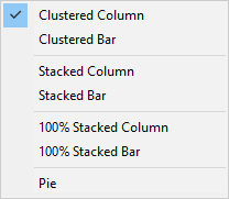
Seven different charts can be selected and displayed (from the Chart drop-list):
When displaying charts, the Rows and Columns terminology is no longer applicable (the charts are not presented as rows and columns). Instead, the first "dimension" is referred to as the Series and the second "dimension" is referred to as the Points:
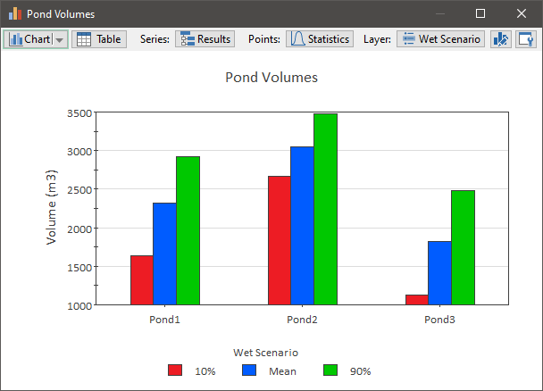
In this column chart, the Series is "All Results" and the Points are "All Statistics".
Unlike tables, in a chart, only one Layer can be displayed. That is, charts can only display two "dimensions". So in this example, we are displaying a particular scenario (the "Wet Scenario"). As was the case for tables, when viewing charts you have the ability to assign any of the dimensions (in this example, results, statistics and scenarios) to the Series, Points or Layer in order to emphasize a particular aspect of your results.
The figure below illustrates how each of the dimensions is represented in a Final Value chart:

In particular,
- The Series is mapped to the label(s) on the axis (X for column charts and Y for bar charts), or for pie charts, the label(s) below the pie(s).
- The Points are used to identify to the item(s) in the legend.
- The Layer being viewed is identified in the legend title.
Several points should be noted regarding how charts are displayed:
- If you have only a single result, a single realization A single model run within a Monte Carlo simulation. It represents one possible path the system could follow through time., no scenarios and no capture times, the result set not very meaningful to display as a Final Value result, as it represents a single data point (and hence there is nothing to compare).
- If you have a "one-dimensional" set of results (e.g., 3 different outputs with a single realization and no Capture Times or scenarios), you can view a bar, column or pie chart, but stacked bar and stacked column charts are not applicable. In this case, there is not a second "dimension" to stack, so a stacked column (or bar chart) would simply look identical to a column (or bar) chart.
- Charts themselves can not extend beyond "two-dimensions", so when you have three "dimensions" in the set of results, you need to select a single value for one of the dimensions (the Layer) when displaying the chart.
- Array A collection of variables that share common output attributes and can be manipulated in GoldSim elements or input expressions. displays in a Final Value result can actually have "four dimensions". In order to view a chart, multiple dimensions need to be fixed to a single value.