An X-Y function chart is a type of sensitivity analysis that provides a graphical representation of the degree to which the Result is sensitive to the specified Independent Variables.
An X-Y function chart can be produced by pressing the X-Y Function Chart... button in the Sensitivity Analysis dialog. When you do so, GoldSim runs a series of deterministic simulations, varying one independent variable at a time through its range of values. In particular, it does the following:
- While holding all other Independent Variables at their Central Value and all other Stochastics (not identified as Independent Variables) at their deterministic values, GoldSim runs n deterministic simulations, where n is the number specified by #Points. For each simulation, the first Independent Variable is varied from its Lower Bound to its Upper Bound.
- The process is repeated for each Independent Variable.
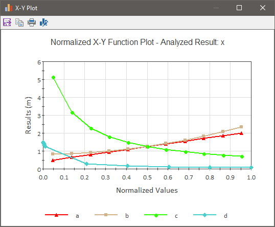
Once it carries out these simulations, it uses the results to construct an X-Y function chart such as this:

The y-axis of an X-Y function chart represents the values of the Result for different values of the independent variables.
There is one line for each variable. Each line illustrates how the Result changes when that independent variable is varied from its Lower Bound to its Upper Bound (with the other variables being held constant). The number of points used to create each line is determined by the #Points field.
Note: One of the points is always the Central Value. Half of the remaining points are spaced evenly (linearly) between the Lower Bound and Central Value, and the other half of the remaining points are spaced evenly (linearly) between the Central Value and the Upper Bound.
Because each variable likely will have different units and a different range, the x-axis does not represent actual values; rather it represents normalized values (and hence they all range from 0 to 1). The normalization differs depending on whether the range of the independent variable was specified as quantiles or was specified directly.
For Stochastic independent variables whose Bounds have been entered as quantiles, the x-axis represents the actual quantile of each point. For Data elements (and Stochastics) whose Bounds have been specified directly (as Lower Bound, Central Value and Upper Bound), the x-axis represents the following:
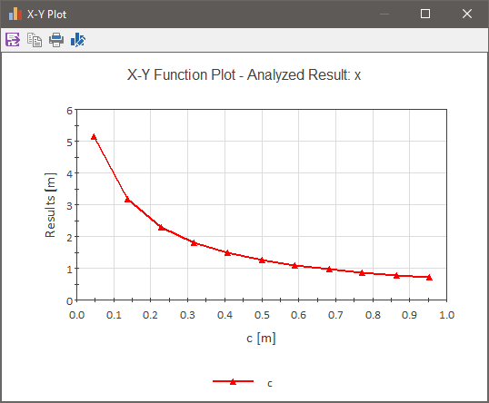
If you would like to plot a single independent variable (on the x-axis) against the result (on the y-axis), using the actual value of the independent variable rather than the normalized value, you can do so by pressing the appropriate button in the column labeled Plot in the Independent Variable table. A chart like this will be displayed:

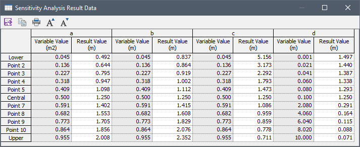
In some cases, you may simply want to view the raw data used to produce the X-Y function chart. You can do so by pressing the Result Data... button in the Sensitivity Analysis dialog. When you do so, a table like this is displayed:

This table shows the actual value for the independent variables (rather than the normalized values).
Note: You can copy the contents of this table to the clipboard. To do so, you must first select the entire table (by double-clicking on the empty cell in the upper left-hand corner of the table, or by pressing Ctrl+A). After you do so, you can copy the table to the clipboard by Ctrl+C). You can subsequently paste the table into another application (such as a spreadsheet).