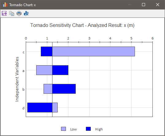
A tornado chart is a type of sensitivity analysis that provides a graphical representation of the degree to which the Result is sensitive to the specified Independent Variables.
A tornado chart can be produced by pressing the Tornado Chart... button in the Sensitivity Analysis dialog. When you do so, GoldSim runs a series of deterministic simulations, varying one independent variable at a time through a range of values. In particular, it does the following:
- While holding all other Independent Variables at their Central Value and all other Stochastics (not identified as Independent Variables) at their deterministic values, GoldSim runs 3 deterministic simulations with three different values for the first dependent variable: the Lower Bound, the Central Value, and the Upper Bound.
- The process is repeated for each Independent Variable.
For example, if there were 10 Independent Variables specified, GoldSim would carry out 30 deterministic simulations to produce the tornado chart.
Once it carries out these simulations, it uses the results to construct a tornado chart such as this:

The x-axis of a tornado chart represents the values of the Result for different values of the independent variables.
Each bar represents the range of Result values produced when each independent variable is set to Lower Bound, Central Value, and Upper Bound (with the other variables being held constant). A light blue bar indicates that the value was produced by the Lower Bound (Low), and a dark blue bar indicates that the value was produced by the Upper Bound (High). For example, this particular chart indicates that the variable d produced a Result equal to about 1.25 when d was at its Lower Bound, and a Result of about 0.2 when d was at its Upper Bound.
The variables are organized from top to bottom according to the total range of Results produced. That is, the variable that produces the largest range of the Result between it Lower and Upper Bound is at the top of the chart. Hence, bars become smaller toward the bottom of the chart, and the overall effect is to take on the appearance of a "tornado".
The solid vertical line represents the value of the Result when the Central Values are used for all independent variables. In this example, the Result using the Central Values is 1.3.
Note: If you have more than 20 independent variables, GoldSim will only plot the top 20 variables in the tornado chart.