You can control the format of the text in a text box by using the buttons and controls at the top of the dialog. These buttons and controls are self-explanatory (and all have tool-tips), and allow you to control the font, size, color, and justification of the text. Note that the text can have multiple fonts, formats and colors. You can also control these options by right-clicking on the text and selecting options from a context menu.
Note: The default font used within the text box can be selected from the Graphic tab of the Options dialog (accessed via Model|Options in the main menu).
Two checkboxes at the bottom of the dialog control its behavior:

If the Border checkbox is checked, a border is placed around the text box.
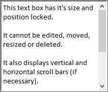
The Lock size & position checkbox switches the text box between display mode and edit mode. If this box is checked, a vertical slider appears in the text box (if necessary), and you cannot move, resize, edit or delete the text box:

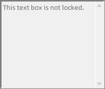
If the Lock size & position checkbox is cleared, the text box can be edited by double-clicking on it, can be moved by selecting and dragging, can be resized by dragging the handles, and can be deleted by selecting and pressing the Delete key. A text box which is not locked appears in the graphics pane The primary portion of the GoldSim interface, where the graphical depiction of the model is shown. like this:

You can unlock a text box in the graphics pane by right-clicking on it and clearing the Lock size & position menu item. Likewise, you can lock a text box in the graphics pane by right-clicking on it and checking the Lock size & position menu item.