By default, grid cells are displayed in the Dashboard A special GoldSim element that allows you to build custom interfaces or "control panels" for your models. as simple edit boxes (with no minimum or maximum value and a default value of 0). You can specify minimum and maximum values, and edit other grid cell properties (i.e., controlling whether they are edit boxes, check boxes or combo boxes) by clicking the blue text corresponding to that particular cell in the "Value Properties" column.
The second radio button allows you to define the grid cell as a Combo Box. If this option is selected, this portion of the dialog becomes active:

You add Value/Label pairs to the Combo Box by entering a Value and a Label, and pressing the Add button. (If you omit a Label, the Value is used for the Label.) Once you have added one or more Value/Label pairs, you can edit them or remove them from the list using the Change and Remove buttons, and change the order they appear in the list using the Up and Down buttons. If you select Auto-sort, they will automatically be sorted into alphabetical order when the control appears in the Dashboard.
Note: You cannot specify a link or expression in the Value field. In fact, this field only accepts numbers without units. If the Data element An input element intended to represent constant inputs in a model. has dimensions An output attribute for an element that defines the dimensionality (in terms of Length, Time and other fundamental dimensions) of the output., these fields assume that the value is being specified in the display units The units (e.g., m, g, $/day) in which an output is displayed within GoldSim. of the Data element (which is displayed at the top of the dialog).
Note: If the item is a condition, the two choices default to True and False, and you cannot add or delete any choices. You can change the labels if required (e.g., On and Off).
The Default is a drop-list with the labels for all of the choices in the list. This Default can be used in conjunction with an optional Button control A special control that can be added to a Dashboard that provides a mechanism for linking a wide range of actions to a button. that the Author can provide in a Dashboard that allows the Player user to reset all input controls to default values.
Note: Within GoldSim, you can reset all of the input controls in a Dashboard to their default values by right-clicking anywhere in the Dashboard, and selecting Set to Default Values.
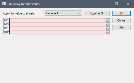
If the item is a vector A one-dimensional array. or a matrix A two-dimensional array., a Default choice is specified for each entry in the array A collection of variables that share common output attributes and can be manipulated in GoldSim elements or input expressions. via a Default Values... button, which displays the following dialog:

You can specify the default choice for each array item individually, or specify a single choice and apply it to all entries.