The Result Status Display control allows you to display one of a series of icons based on the value of an output (e.g., if the value is less than 10, display a Green circle, if the value is between 10 and 30 display a yellow circle, and if the value is greater than 30 display a red circle):
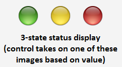
This can be used to visually indicate the state of a variable in your Dashboard A special GoldSim element that allows you to build custom interfaces or "control panels" for your models. (e.g., whether a pump is on or off; whether a variable has reached a dangerous level).
The toolbar button can be found here:
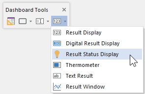
The Result Status Display control An output control that can be added to a Dashboard that provides a mechanism for displaying a series of icons that indicate the status (value) of an output. looks like this when it is first added to a Dashboard and selected:

The eight handles allow you to resize the control (and the associated images).
Double-clicking on the control displays the following properties dialog:
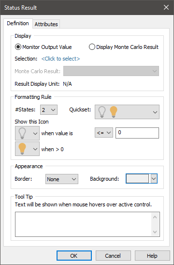
Within the Display portion of the dialog, the output to which the control is to be linked is specified. Before doing so, however, you must specify the type of result you wish to display:
Monitor Output Value: This is the default, and will display the actual value of the selected output.
Display Monte Carlo Result: This should be selected if you wish to display a statistical result for an output from a Monte Carlo simulation A method for propagating (translating) uncertainties in model inputs into uncertainties in model results. (e.g., the mean value or a particular percentile).
After selecting the type of result you wish to display, you select the specific output by pressing <Click to select>. This will display a browser An alternative view of a GoldSim model, in which elements are displayed in a tree, and organized either hierarchically, or by type. for selecting the element of interest. If you have selected "Monitor Output Value", the browser will contain all elements in the model. In this case, any scalar An output consisting of a single value or condition. output can be selected. If you have selected "Display Monte Carlo Result", the browser will contain only the Distribution Result elements in the model (i.e., in this case, you must link to a Distribution Result element A Result element that provides a way to view the final values of probabilistic outputs., and the first result in the element will be used).
Once you have linked the control to an element, the linked element will be listed:
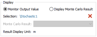
You can remove the linkage (by pressing the red X button), or reassign the linkage (by pressing the name of the element itself).
Note that if you have selected "Display Monte Carlo Result", you must also display the type of statistical result to display:
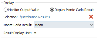
Note: Result Status Display controls can be linked to both values and conditions. If the control is linked to a condition and "Monitor Output Value" is selected, icons must be selected for True and False. If the control is linked to a condition and "Display Monte Carlo Result" is selected, however, statistics are generated by assuming True = 1 and False = 0 (and hence icons are chosen for values ranging from 0 to 1).
Once you have selected the element that will be monitored, you must then select the set of icons that will be used to indicate various states. In the example above (the default setting), the control represents two states: if the value is less than or equal to 0, an unlit light bulb will be displayed; if the value is greater than 0, a lit light bulb will be displayed.
GoldSim provides a collection of preset icons that can be used. The complete set is shown below:
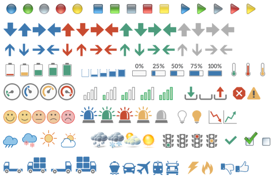
There are two ways to select icons. The easiest way to select a set of icons from the Quickset drop-list. This provides a number of logical sets that you can select from. Alternatively, you can select the number of states you wish to have (#States) and then select the icon for each state from a drop list. GoldSim supports from two to five states.
In either case, you must assign the conditions pertaining to each state (i.e., the set of values that results in each icon being displayed).
For example, in this case, four different states have been selected, with four different icons:
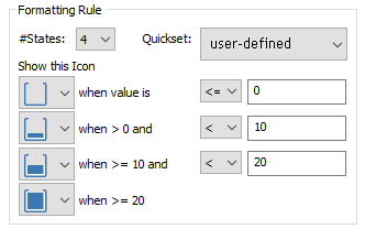
In this example,
- An empty container is displayed if the value is <= 0;
- A slightly full container is displayed if the value is > 0 and < 10;
- A half full container is displayed if the value is >= 10 and < 20; and
- A full container is displayed if the value is >= 20.
The conditional operators (<, <=, >, >=) can be controlled via drop-lists. Note, however, that GoldSim ensures that they are consistent in terms of whether the choices change with increasing or decreasing values. That is, if one operator is > or >=, all the other conditions must also be > or >=.
The fields to the right of each conditional operator only accept numbers without units. If the element has dimensions An output attribute for an element that defines the dimensionality (in terms of Length, Time and other fundamental dimensions) of the output., these fields assume that the value is being specified in the display units The units (e.g., m, g, $/day) in which an output is displayed within GoldSim. of the element (which is displayed at the top of the dialog).
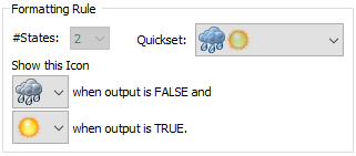
Result Status Display controls can be linked to both values and conditions. If the control is linked to a condition (and "Monitor Output Value" is selected such that only two outcomes are possible), #States is fixed at 2, and the first icon is shown when the element is False, and the second icon is displayed when the image is True:
The Appearance section of the properties dialog allows you to modify the Background (color), and type of Border for the icons that are displayed. These options are self-explanatory, and you may want to experiment with them to see how they change the control's appearance.
The size of the icons displayed in the field is controlled by the size of the control, which you can adjust by grabbing the sizing handles (you can also change these sizes by right-clicking on the control and selecting a size from Set Size).
The bottom section of the dialog allows you to enter a tool tip, which will be displayed whenever the Dashboard user holds the mouse cursor over the control.
The Attributes tab of the dialog provides tools that allow you to hide or disable the control dynamically based on the values of various model outputs. This allows you, for example, to hide the control if it was not applicable under certain situations.