Depending on the type of chart and the number of outputs being plotted, up to three axis tabs may be present in the Chart Style dialog (there are always at least two):
|
Chart Type |
X-axis |
Y-axis |
Y2-axis |
Z-axis |
|
Time History |
X |
X |
X |
|
|
Distribution |
X |
X |
|
|
|
Scatter Plot |
X |
X |
|
X |
|
Array |
X |
X |
|
X |
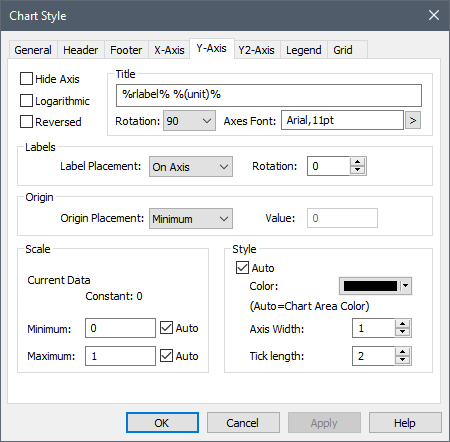
The X, Y and Y2 axis tabs have the same appearance (with one minor exception noted below).
At the top of the dialog, GoldSim indicates what the particular axis represents, along with its units (if applicable).
The various fields in this tab are described below:
Title: This is the axis title. If you right-click within the Title edit field, a context menu providing a list of keywords will be provided. Keywords allow you to automatically insert text that is determined automatically by the context of the result (e.g., the keywords %rlabel% %(unit)% inserts the result label and the display units for the output associate with the axis). This allows you to use a single chart style for multiple results.
Title Rotation: This is only available for the Y and Y2 axes. There are three options: 90 (the default), in which the title is rotated and read from bottom to top; 270, in which the title is rotated and read from top to bottom; and None, in which the title is not rotated (i.e., is horizontal), and is placed at the top of the axis.
Axis Font: This provides access to a dialog for specifying the font for the axis. Note that this font is applied to all axes (i.e., all axes must use the same font).
Hide Axis: If this box is checked the entire axis (and all annotation) is hidden.
Logarithmic: If this box is checked, the axis is plotted logarithmically (rather than linearly). Note that if the data set you are plotting contains numbers which are less than or equal to zero, these points cannot be plotted on a logarithmic axis. Therefore, if you make the axis logarithmic in such a situation, GoldSim will omit these points from the plot (i.e., they will appear as "holes" or "gaps" in the plot).
 Note: Bar charts cannot be
plotted on a logarithmic axis. For example, when plotting a distribution chart
as a PDF, the X-axis cannot be logarithmic. If you check the Logarithmic
box, it will be ignored. In addition, 2-D and 3-D scatter plots cannot be
plotted using logarithmic axes. In these cases, the Logarithmic box
is grayed out.
Note: Bar charts cannot be
plotted on a logarithmic axis. For example, when plotting a distribution chart
as a PDF, the X-axis cannot be logarithmic. If you check the Logarithmic
box, it will be ignored. In addition, 2-D and 3-D scatter plots cannot be
plotted using logarithmic axes. In these cases, the Logarithmic box
is grayed out.
Reversed: If this box is checked, the axis numbering is reversed (e.g., going from high values to low values rather than from low values to high values).
Label Placement: This is only available for the X, Y and Y2 axes, and determines where the axis labels are placed relative to the other (orthogonal) axis. There are three options: On Axis (the default), in which the labels are placed alongside the axis, Minimum (in which they are placed at the minimum value of the other axis), or Maximum (in which they are placed at the maximum value of the other axis).
Label Rotation: This determines the angle that the axis numbers are rotated. The default is 0.
Origin Placement: This is only available for the X, Y and Y2 axes, and determines where the axis intersects the orthogonal axis (e.g., where the X-axis intersects Y-axis). There are three options: Minimum (the default), in which it intersects at the minimum value of the other axis; Maximum, in which it intersects at the maximum value of the other axis; or At Value, in which it intersects at the Value on the other axis indicated directly to the right.
Note: You cannot select label
or origin placement for the Y axes for a time history chart with two vertical (Y
and Y2) axes.
Scale Minimum: This is the minimum value (lower bound) on the axis. If Auto is checked, GoldSim will select the value for you (based on the range).
Scale Maximum: This is the maximum value (upper bound) on the axis. If Auto is checked, GoldSim will select the value for you (based on the range).
Note: If the axis being
plotted is a date, the scale minimum and maximum will display date and time
controls so you can specifically select a date/time range.
Color: This is the color of the axis and all of the annotation. If Auto is checked, the foreground color specified for the Chart Area (in the General tab) will be used.
Axis Width: This is the width of the axis lines, in pixels
Tick Length: This is the tick length, in pixels.
Note: One key attribute for
charts is how values on axes are displayed. You cannot control the number
of significant figures displayed (this is automatically determined). You
can, however, control under what circumstances scientific notation is used via
the Results tab of the Options dialog (accessed via Model
|Options… from the main menu).
Note: When viewing a 3D scatter
plot, some of the axis options are fixed by GoldSim and will automatically be
grayed out in the X-Axis and Y-Axis tabs.
Learn more about:
Specifying the Axis Appearance for 3D Charts