We can create a "two-dimensional" data set by running a Monte Carlo simulation A method for propagating (translating) uncertainties in model inputs into uncertainties in model results.. In this case, the final values we would want to look at would likely be statistics (e.g., the mean and some percentiles), although we could also look at all the realizations together (something you would typically not do). The "dimensions" in this case would be the output(s) and the statistic(s) or the output(s) and the realizations. The tabular form of the results (for a Final Value result in which we had three different outputs and were interested in three different statistics) could be viewed in two different ways (since the rows and columns can be switched):


When we move from a "one-dimensional" to a "two-dimensional" data set we can explore and compare the results in more ways. For example, we could produce a clustered column chart like this:
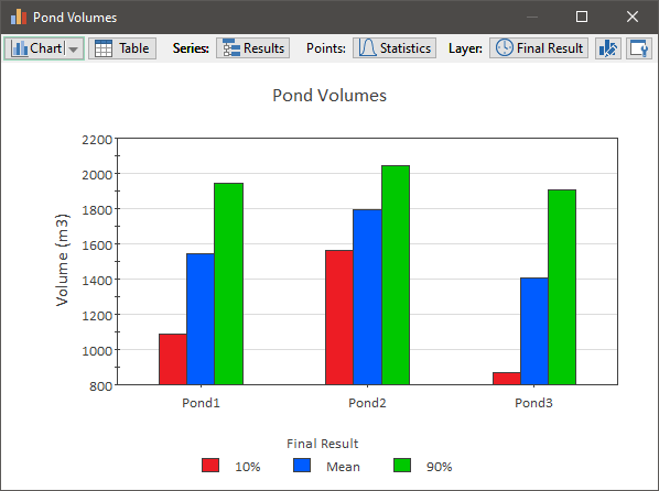
This chart displays three clusters (groups) of columns. Each cluster represents a different output, and each column represents a different statistic for that cluster. The Final Value result, however, can also "flip" how this information is displayed:
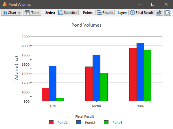
In this case, each group of columns represents a different statistic, and each column represents a different output.
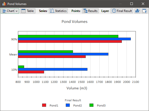
These two displays are in the form of column charts, but we also display bar chart versions of these same results. For example, here is the chart for the same data, shown as a clustered bar chart:
We can also display "two-dimensional" pie charts:
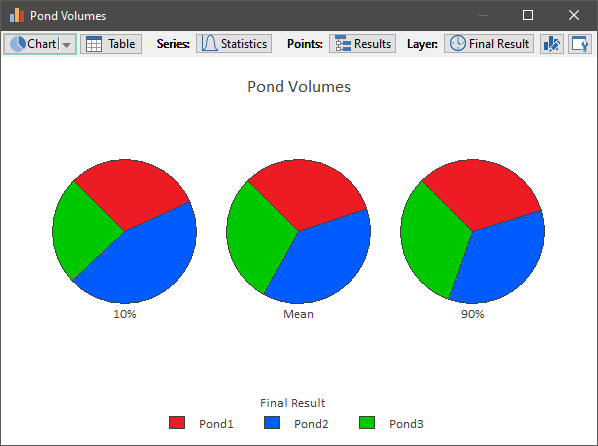
In this case, each pie represents a different statistic, with each pie slice representing a different output. Alternatively, however, we could specify that each pie represents a different output, and each pie slice represents a different statistic.
Finally, having a "two-dimensional" set of data allows us to make use of stacked bar and stacked column charts. That is, rather than presenting the data using clusters of columns (or bars), we can present it using stacked columns (or bars):
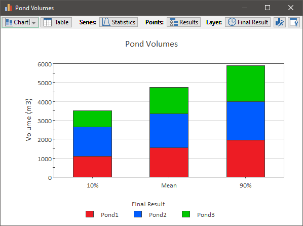
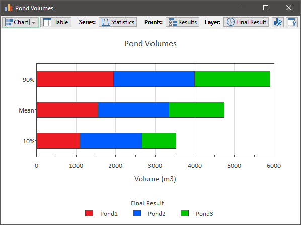
Stacked bar and column charts can also be displayed as percentages (of all the items in the "stack") rather than values. Here is what the stacked column chart above would look like if displayed as a 100% stacked column chart:
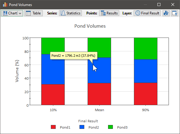
Such a chart is similar to a pie chart (in that all of the sections add to 100%).