Running a model in different ways can add additional "dimensions" (beyond two) to the set of data that you wish to display. For example, you could run a probabilistic model for two different scenarios and display the result for three different outputs. You would then have three "dimensions" of results in the data set (outputs, statistics, scenarios). Charts themselves can not extend beyond "two-dimensions", so when you have three "dimensions" in the set of results, you need to select a single value for one of the dimensions (referred to as the Layer) when displaying the chart. But having three dimensions provides great flexibility in how you display the data.
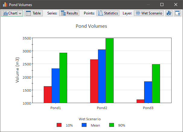
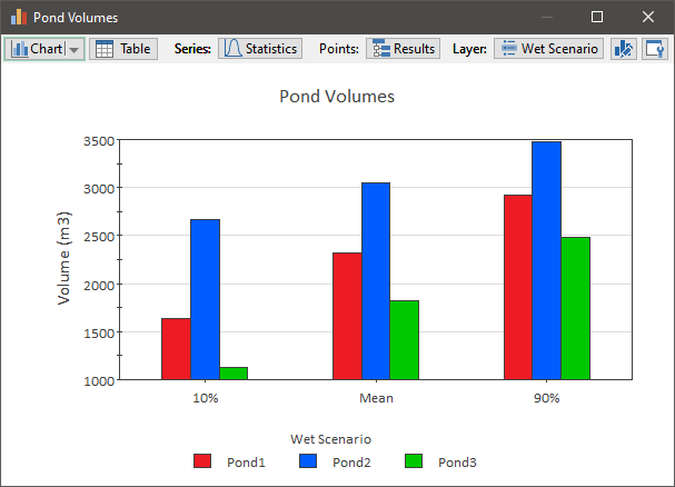
For example, you could choose to display a column chart showing all outputs and all statistics for a particular scenario (in two different ways):
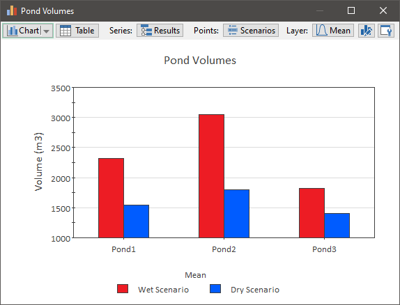
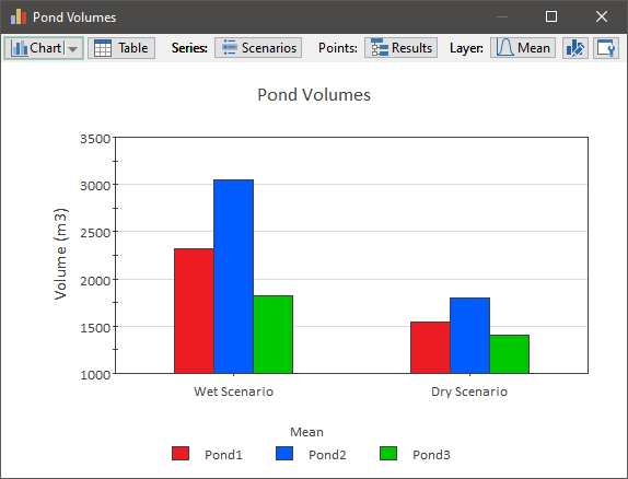
Alternatively, we could choose to display a column chart showing all outputs and all scenarios for a particular statistic (in two different ways):
Finally, we could choose to display a column chart showing all scenarios and all statistics for a particular output (in two different ways):
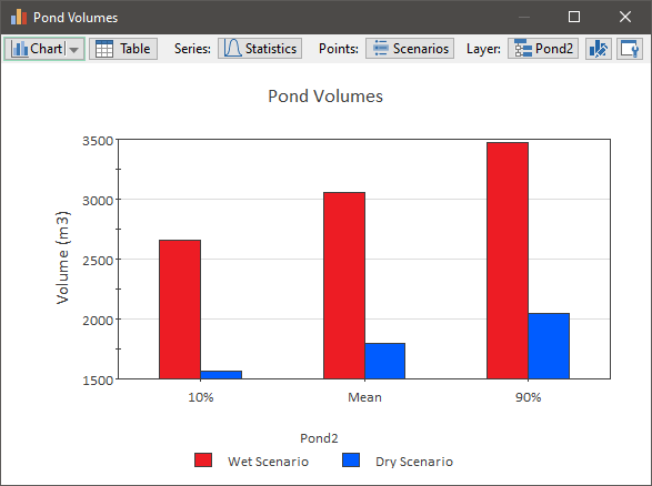
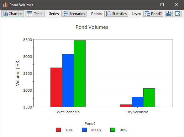
We produced six different column charts displaying the same results in different ways (which allows you to emphasize different aspects of the results). Note that we could have also produced equivalent stacked column charts, bar charts, stacked bar carts, and pie charts (six different charts for each type of display).
The tabular view of this data would look like this (and could also be displayed in multiple ways, by switching what is displayed in the rows and columns):

In the case of tables, unlike charts, the "third dimension" can be fully displayed (GoldSim simply increases the number of columns).