In some cases, you need to display accumulated, average, the change or the rate of change of values over specified periods (e.g., monthly, annually). For example, you may need to report the cumulative amount of money or water that moved from one point to another each month.
To support this, GoldSim allows you to define Reporting Periods. Scheduled updates (timesteps) are created at the end of each Reporting Period. Hence, these can also be thought of as “Reporting Steps”. However, whereas results saved at Basic Steps always represent instantaneous values, results saved at Reporting Periods can not only be displayed as instantaneous results, but can also report accumulated, averaged, the change or the rate of change of values over a specified period (e.g., monthly).
Results based on Reporting Periods (e.g., cumulative values over each period, average values over each period, etc.) can be accessed and viewed via Time History Result elements.
It is important to understand that the act of creating Reporting Periods does not in itself provide specialized Reporting Period-based results (e.g., accumulated or averaged results). This is because Reporting Periods by default simply provide another way to define timesteps, since as noted above, scheduled updates (timesteps) are created at the end of each Reporting Period. By default, Time History results simply provide instantaneous values at each timestep (and hence, if Reporting Periods are defined, at the end of each period).
To display specialized Reporting Period-based results, you must add the outputs you are interested in to a Time History Result element, and then specify that you want to view Reporting Period-based results.
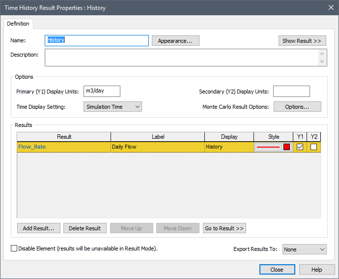
By default, the dialog for a Time History Result element looks like this:
 Note: For multiple realization runs,
the Display column is replaced with Custom Statistic.
Note: For multiple realization runs,
the Display column is replaced with Custom Statistic.
In particular, note that by default, the Time Display Setting in this dialog is set to “Simulation Time”. In this case, Time History results simply provide instantaneous values at each timestep (and hence, if Reporting Periods are defined, at the end of each period).
If you have defined Reporting Periods, you can select “Reporting Periods” for the Time Display Setting. When you do so, the Result Properties dialog looks like this:
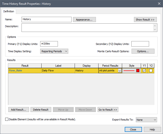
Note that a new column has been added, titled Period Results. This is a drop-list that allows you to select results based on Reporting Periods. The list consists the following options:
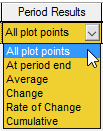
•All plot points: This displays instantaneous values at all the plot points (scheduled updates). This would include not only values at the end of each Reporting Period, but also values at all other scheduled updates (e.g., Basic Steps). This display is identical to what you would see if you selected “Simulation Time” for the Time Display Settings. Note, however, that the values of all plot points only appear in charts. In tables, only values at the end of each Reporting Period are shown.
•At period end: This displays instantaneous values at at the end of each Reporting Period. It is the default.
•Average: This computes the average value for each Reporting Period. For example, if you had a Basic Step of 1 day, a monthly minor Reporting Period and annual major Reporting Period, GoldSim would display either monthly or annual averages (you select in the display window which to show).
•Change: This computes the change in the value over each Reporting Period (the difference between the value at the end of the current Reporting Period and the value at the end of the previous Reporting Period).
•Rate of Change: This computes the rate of change in the value over each Reporting Period (from the end of the previous Reporting Period to the end of the current Reporting Period). That is, it is the Change (defined above) divided by the length of the Period. It has dimensions of X/Time, where X is the dimensions of the actual output.
•Cumulative: This computes the integral of the value over each Reporting Period (from the end of the previous Reporting Period to the end of the current Reporting Period). It has dimensions of X*Time, where X is the dimensions of the actual output. This would typically be used in cases where the output was a rate (e.g., m3/day), such that the cumulative value represents the quantity (e.g., m3) that flowed or accumulated over the period.
Note: Most spreadsheet models
implicitly compute accumulated values (e.g., cumulative flows) over a
step. Hence, if you want to compare GoldSim with a spreadsheet model, you
should use Reporting Periods to define your steps, and view the Cumulative
result.
Note: If
your result is a condition, only two of the Period Result types are applicable:
“All plot points” and “At period end”. Hence, these are the only two
choices in the drop-list.
Note: In order to display
most types of Reporting Period results, you must add the result to the Result
Properties dialog before you run the model (i.e., while you are in Edit Mode). This is
because they are actually computed “on the fly” as the model is running (e.g.,
the Cumulative option integrates values during the simulation). Hence, if
you try to add a result to a Time History Result element with a Time Display
Setting of “Reporting Periods” while in Result Mode, the only available
Reporting Period options are “All plot points” and “At period end”.
To understand the use of Reporting Period-based results, it is instructive to view an example. In the example below, the same output (Flow_Rate) is added to the Result element twice:
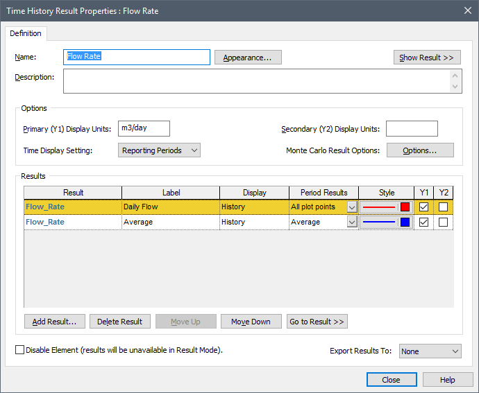
In this particular model, a daily Basic Step has been defined, along with a Major (annual) and minor (monthly) Reporting Period. The first item in the list instructs GoldSim to display the instantaneous value of the output at all plot points. The second item in the list instructs GoldSim to display the average value of the output over the Reporting Period.
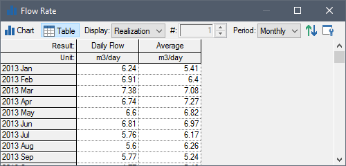
If you have defined both a Major Period and a Minor Period, you must specify which Period to display when viewing results. In this example, you would need to select whether you wish to display monthly or annual averages at the top of the display. In this case the monthly values are being shown:
In this case the annual values are being shown:
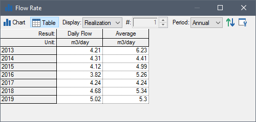
Note that the table only displays results corresponding to the actual reporting periods (even though the first item, labeled “Daily Flow” here, was selected to display “All plot points” in the Properties dialog). Hence, in this table, the column labeled “Daily Flow” displays the instantaneous values at the end of each period, while the column labeled “Average” displays the average values over each period. As will be shown below, however, when “All plot points” is selected for an item, all points are displayed in a chart.
When displaying charts of Reporting Period-based results, you must specify how you would like the values to be plotted. This is because, for four of the result types (Average, Change, Rate of Change and Cumulative), the results actually apply for an entire period (as opposed to the end of the period). To represent this, GoldSim provides two options for plotting these results, illustrated in the examples below. In these examples, the Daily Flow and the Average are displayed on the same chart:

In this case, the major (annual) Reporting Period Average is plotted as a horizontal line over the period (a stair-step). Here is the same plot displaying the minor (monthly) Reporting Period results:

Alternatively, the plot can be displayed like this (these are showing annual results again):

In this case, the major (annual) Reporting Period Average is plotted as a line connecting the mid-point of each period (this can be seen better by changing the style to add a symbol at each data point):

Here is the same plot (without the symbols) displaying the minor (monthly) Reporting Period results with lines drawn between mid-points:

The type of plot is controlled by this button at the top of the display window:
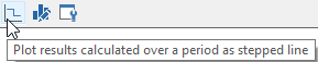
If the button is pressed, the plot is shown as a stair-step; otherwise it is shown as lines connected the mid-points.
Note that this option (to plot as a stair-step) is only used when you have selected to display Average, Change, Rate of Change or Cumulative Reporting Period-based results. If you select “All plot points”, all points are plotted (and connected by lines), as shown in the “Daily Flow” line above. If you select “At period end”, the values are plotted at the end of each period (as opposed to the mid-points) plotted (connected by lines):

Note that if you select either “Cumulative” or “Rate of change”, and you simultaneously select any of the other result types, the Y2 axis must also be used, since the dimensions of the result are different from that of the output:

A simple example file illustrating Reporting Periods (ReportingPeriods.gsm) can be found in the can be found in the General Examples/ Running folder in your GoldSim directory (accessed by selecting File | Open Example... from the main menu).
Learn more about: