
Thermometer output controls allow outputs to be viewed as thermometers. The thermometer can be oriented vertically or horizontally.
The toolbar button looks like this:
Thermometer Control Button
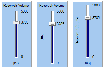
The Thermometer control looks like this when it is added to a Dashboard and selected:
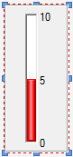
The eight handles allow you to resize the control. For more precise changes, you can also change the width of the control using Ctrl-Left and Ctrl-Right, and change the height using Ctrl-Up and Ctrl-Down. (The default change is 1 pixel at a time. If you press the Shft key, the change is 5 pixels).
Note, however, that as discussed below, resizing the control does not resize the labels. The label font size is fixed (it uses the default GUI font specified by the operating system).
Double-clicking on the control displays the following properties dialog:
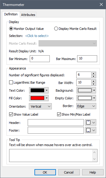
Within the Display portion of the dialog, the output to which the control is to be linked is specified. Before doing so, however, you must specify the type of result you wish to display:
Monitor Output Value: This is the default, and will display the actual value of the selected output.
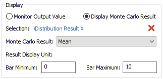
Display Monte Carlo Result: This should be selected if you wish to display a statistical result for an output from a Monte Carlo simulation (e.g., the mean value or a particular percentile).
After selecting the type of result you wish to display, you select the specific output by pressing <Click to select>. This will display a browser for selecting the element of interest. If you have selected “Monitor Output Value”, the browser will contain all elements in the model. In this case, any scalar value output can be selected. If you have selected “Display Monte Carlo Result”, the browser will contain only the Distribution Result elements in the model (i.e., in this case, you must link to a Distribution Result element, and the first result in the element will be used).
Once you have linked the control to an element, the linked element will be listed:
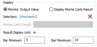
You can remove the linkage (by pressing the red X button), or reassign the linkage (by pressing the name of the element itself).
Note that if you have selected “Display Monte Carlo Result”, you must also display the type of statistical result to display:
 Note: Thermometer controls can
only be linked to value outputs (they cannot be linked to conditions).
Note: Thermometer controls can
only be linked to value outputs (they cannot be linked to conditions).
The Bar Minimum and Bar Maximum define the range of values represented on the Thermometer. Note that you cannot specify a link or expression in these fields. In fact, these fields only accept numbers without units. If the output has dimensions, these fields assume that the value is being specified in the display units of the output (which is displayed directly to the right of these two fields).
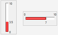
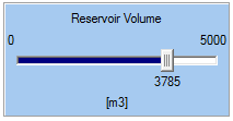
The Thermometer control provides a wide variety of options for controlling the appearance of the control. The most fundamental of these are the Orientation, and whether the Thermometer displays the values (Show Value Label) and minimum and maximum labels (Show Min/Max Label). By default, a Thermometer is vertical and all labels are on. You can make the Thermometer horizontal by changing the Orientation. (You can also make the Thermometer horizontal when it is inserted by holding the Ctrl key down when you click on the Thermometer button in the toolbar).
The minimum, maximum and value labels always appear to the right of a vertical Thermometer. If the Thermometer is horizontal, the minimum and maximum labels are always on top, and the value label is on the bottom:
Note: In a vertical
Thermometer, minimum or maximum labels are automatically hidden if the value
label would otherwise overlap them.
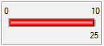
If the value of the output displayed by the Thermometer is outside of the range of the control (i.e., less than the Minimum or greater than the Maximum), the actual value is displayed at the limit of the Thermometer:
The Logarithmic Bar Range check box does not change the appearance directly. Rather, it simply changes the way that the current value is displayed between the minimum and maximum (by dividing the range logarithmically rather than linearly). If you do choose a logarithmic scale, it is recommended that you indicate this in the Header or Footer labels (see below).
The Header and Footer fields allow you add labels to your Thermometer (e.g., describing what is being displayed, the units, and whether it is a logarithmic scale). The drop list to the right of these fields determines where the label is placed. For a vertical Thermometer, the Header can be at the top (left, centered or right justified) or on the left side (rotated 90˚); and the Footer can be at the bottom (left, centered or right justified) or on the left side (rotated 90˚). Three possible combinations of these options are shown below:
For a horizontal Thermometer, the options are more limited: the Header must be at the top (left, centered or right justified) and the Footer must be at the bottom (left, centered or right justified):
The Number of significant figures displayed field allows you to specify the number of significant figures displayed in the control. It applies to the minimum and maximum labels, as well as the value label. Trailing zeros after a decimal are omitted. (In the examples above, this field has been set to 4).
Note: You cannot select the
font or font size for any of the labels in a Thermometer control. GoldSim always
uses the default GUI font and font size used by the operating system.
The remaining options at the bottom of the dialog allow you to determine how the Thermometer control will appear on the Dashboard. The Background refers to the color of the body of the control. The Text Color controls the color of all the labels. The Empty Color refers to the “unfilled” portion of the Thermometer, while the Fill Color refers to the “filled” portion of the Thermometer. The Bar Width controls the thickness of the thermometer bar itself. The size is specified in pixels, and can range from 4 to 100 (the default is 10). The Border determines the appearance of the border of the control. You will likely want to experiment with these options to see how they change the control’s appearance.
Note: Using and creating
custom colors for objects is discussed in detail in Chapter 6 of the GoldSim
User’s Guide.
The bottom section of the dialog allows you to enter a tool tip, which will be displayed whenever the Dashboard user holds the mouse cursor over the control.
The Attributes tab of the dialog provides tools that allow you to hide or disable the control dynamically based on the values of various model outputs. This allows you, for example, to hide the control if it was not applicable under certain situations.
Learn more about: