
The Slider control allows the user to select a value using a slider. The thermometer can be oriented vertically or horizontally.
The toolbar button looks like this:
Slider Control Button
The Slider control looks like this when it is added to a Dashboard and selected:
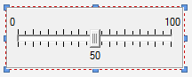
The eight handles allow you to resize the control. For more precise changes, you can also change the width of the control using Ctrl-Left and Ctrl-Right, and change the height using Ctrl-Up and Ctrl-Down. (The default change is 1 pixel at a time. If you press the Shft key, the change is 5 pixels).
Note, however, that as discussed below, resizing the control does not resize the labels. The label font size is fixed (it uses the default GUI font specified by the operating system).
Double-clicking on the control displays the following properties dialog:
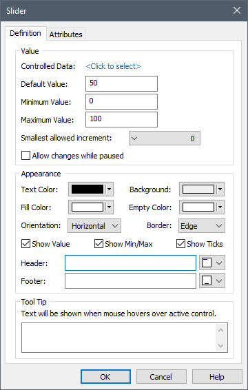
Within the Value portion of the dialog, the Data element to which the control is to be linked is specified. You do this by pressing <Click to select>. This will display a browser which shows all of the scalar value Data elements in the model (condition Data elements are not listed).
Once you have linked the control to an element, the linked element will be listed:

You can remove the linkage (by pressing the red X button), or reassign the linkage (by pressing the name of the element itself).
The Default value can be used in conjunction with an optional Button control that the Author can provide in a Dashboard that allows the Player user to reset all input controls to default values.
 Note: Within GoldSim, you can
reset all of the input controls in a Dashboard to their default values by
right-clicking anywhere in the Dashboard, and selecting Set to Default
Values.
Note: Within GoldSim, you can
reset all of the input controls in a Dashboard to their default values by
right-clicking anywhere in the Dashboard, and selecting Set to Default
Values.
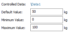
The Minimum and Maximum values define the range of values allowed in the Slider. Note that you cannot specify a link or expression in the Default, Minimum and Maximum fields. In fact, these fields only accept numbers without units. If the Data element has dimensions, these fields assume that the value is being specified in the display units of the Data element (which are displayed directly to the right of the three fields):
 Warning: If the Data element
to which the control is linked has dimensions, the Slider control assumes that
the value is being entered in the display units of the Data element.
Hence, as an author, it is your responsibility to inform the user of the units
of the input. The easiest way to do this is to specify the units in either
the Header or Footer label for the control (see below).
Warning: If the Data element
to which the control is linked has dimensions, the Slider control assumes that
the value is being entered in the display units of the Data element.
Hence, as an author, it is your responsibility to inform the user of the units
of the input. The easiest way to do this is to specify the units in either
the Header or Footer label for the control (see below).
The Smallest allowed increment is a drop list that lets you control the precision of the values that can be entered into the Slider. For example, if you select 0.1 in this field, the Slider will only jump between values that are multiples of 0.1; if you enter 100 in this field, the slider will only jump between values that are multiples of 100. The default value of 0 puts no constraints on the value.
When using a Slider control in the Player, the user can specify a value exactly by right-clicking on the slider control handle. This will display a small edit control which allows the user to type in a value directly. Pressing Enter or Esc closes this edit control. Note, however, that if the Dashboard user enters a value that does not meet the Smallest allowed increment, the value will be rounded to the nearest valid value.
Note: In order to make the
user aware of the feature to specify values exactly when using a Slider control,
you may want to discuss this in the tool-tip for the slider control (or in text
somewhere on the Dashboard).
The Allow changes while paused check box determines whether Dashboard users will be able to edit the field in the middle of a simulation (i.e., after the model is paused). If this check box is cleared (the default) the user can only edit the field prior to the start of the simulation. If the model is paused, the field will not be editable. If the check box is checked, the user will be permitted to edit the field while the model is paused in the middle of a simulation.
Note: Even if this box is
checked, if the model contains any scenarios, no changes can be made while the
model is paused.
The Slider control provides a wide variety of options for controlling the appearance of the control. The most fundamental of these are the Orientation, and whether the Slider displays the value (Show Value Label) and minimum and maximum labels (Show Min/Max Label). By default, a Slider is horizontal and all labels are on. You can make the Slider vertical by changing the Orientation. (You can also make the Slider vertical when it is inserted by holding the Ctrl key down when you click on the Slider button in the toolbar).
The minimum, maximum and value labels always appear to the right of a vertical Slider. If the Slider is horizontal, the minimum and maximum labels are always on top, and the value label is on the bottom:
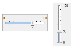
Show Ticks determines whether tick marks are shown in the Slider (and is on by default). The number of ticks displayed is determined automatically by GoldSim. Note that the tick marks displayed are always consistent with the Smallest allowed increment. For example, if the Smallest allowed increment was 10, then the tick marks would never be less than 10 units apart.
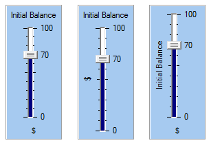
The Header and Footer fields allow you to add labels to your Slider (e.g., describing what is being entered and the units). The drop list to the right of these fields determines where the label is placed. For a vertical Slider, the Header can be at the top (left, centered or right justified) or on the left side (rotated 90˚); and the Footer can be at the bottom (left, centered or right justified) or on the left side (rotated 90˚). Three possible combinations of these options are shown below:
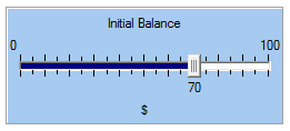
For a horizontal Slider, the options are more limited: the Header must be at the top (left, centered or right justified) and the Footer must be at the bottom (left, centered or right justified):
Note: You cannot select the
font or font size for any of the labels in a Slider control. GoldSim always uses
the default GUI font and font size used by the operating system.
The remaining options at the bottom of the dialog allow you to determine how the Slider control will appear on the Dashboard. The Background refers to the color of the body of the control. The Text Color controls the color of all the labels. The Empty Color color refers to the “unfilled” portion of the Slider channel, while the Fill Color refers to the “filled” portion of the Slider channel. The Border determines the appearance of the border of the control. You will likely want to experiment with these options to see how they change the control’s appearance.
Note: Using and creating
custom colors for objects is discussed in detail in Chapter 6 of the GoldSim
User’s Guide.
The bottom section of the dialog allows you to enter a tool tip, which will be displayed whenever the Dashboard user holds the mouse cursor over the control.
The Attributes tab of the dialog provides tools that allow you to hide or disable the control dynamically based on the values of various model outputs. This allows you, for example, to hide the control if it was not applicable under certain situations.
Learn more about: